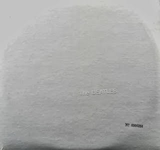
^ Original album sleeve, featuring the embossed band name and serial number
^ Vinyl version (released in US after album)
^ Prince, the black album.
^ Arctic Monkeys, Suck It And See
^ Metallica, The Black Album
The minimalistic and simplistic style that I have used in my work is not an obvious convention, however after doing some research I have found that some of the most famous artists/albums use this convention. Above are examples of four different album covers from some of the most successful musicians in the world, proving that the minimalistic convention that I have exhibited in my own is a successful way of advertising a artist/band's music. The Beatles 'White Album' sleeve was designed by Richard Hamilton, who is known as 'The Father of Pop art', Hamilton was a very successful British painter and artist, the band's name was discreetly embossed slightly below the idle of the a bum's right side and the cover also featured a unique stamped serial number. Hamilton wanted the album cover to resemble the style of conceptual art that was becoming a huge contemporary movement at the time. Above is also an image of the vinyl record that was later released in the US which showed the titled printed in grey rather than embossed letters.
Above are more examples of
very simple and minimalistic album covers by successful bands/artists. Prince and Metallica both released albums named 'The Black Album'. Prince's version had no printed title, artist name, production credits or photography printed. The promotional versions of this album only had a song listing and catalog number, and the commercial version only had the catalog number printed in pink on the spine.
All of these examples confirm that the minimalistic approach I have taken on my Digipak and magazine advert is an existing and successful convention.


No comments:
Post a Comment